CSS Grid Layout Module
Grid layout is a new and powerful CSS layout system that allows to divide a web page content into rows and columns in an easy way.
Basic concept -
Grid container -
The grid container is the outer element that contains the grid layout.
All of its direct children are grid items.
To make an element a grid container, set its display property to grid or inline-grid.
The difference is an element with display: grid will be a block element, where an element with display: inline-grid will be an inline element.
Grid item
All immediate children of the grid container are grid items. Beyond the immediate children, descendant elements are not grid items. No special CSS properties need to be applied to make an item a grid item. The child elements automatically become grid items, and by default they are laid out in the order that they appear in the HTML markup.
Grid lines -
Grid lines divide the rows and columns of the grid as we can see in below image -
Grid areas -
A grid area is the space enclosed by any four grid lines. It can contain a single cell or multiple cells. A 4x4 grid area is highlighted in below image -
Basic grids -
To set up the rows and columns of the explicit grid, the grid-template-rows and grid-template-columns properties are used.
These are used to specify the widths of the rows and the heights of the columns, respectively.
Technically speaking, they are used to specify the size of the grid tracks.
Like with flexbox, by default grid items are flush up against one another.
With grid items, we can use the gap property to add a gap between grid items. This can help us better visualize the grid layout.
Now we will see Example-
Example -
Output -
Now we will see all the grid properties with examples -
1. Display Property
As with flexbox, grid layout applies to two levels of the DOM hierarchy.
An element with display: grid becomes a grid container.
Its child elements then become grid items.
Next, you’ll apply a few new properties to define the specifics of the grid.
Add the styles from this example given below to your stylesheet.
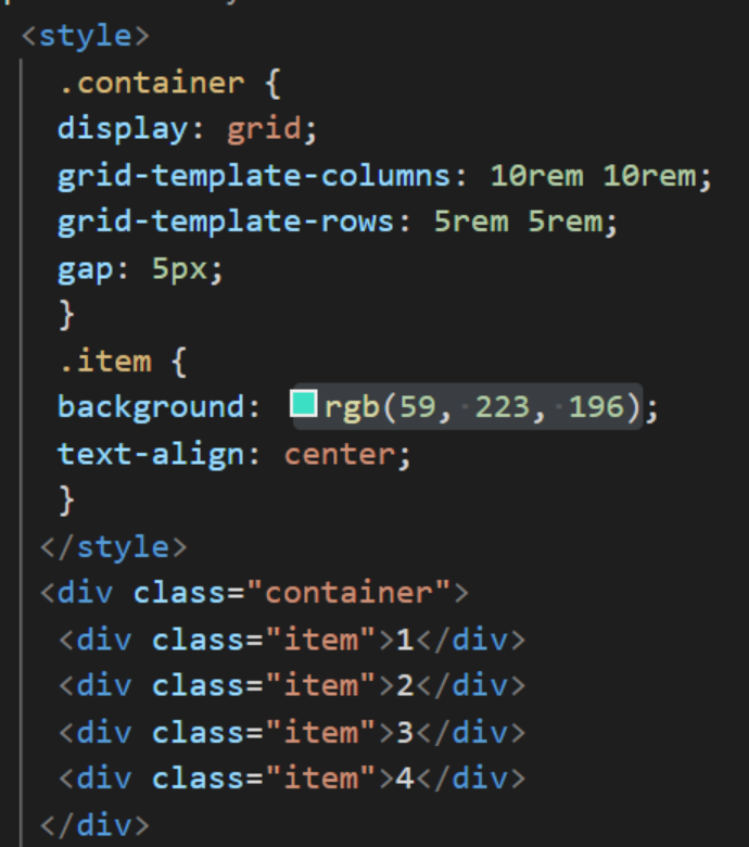
Example - Using display:grid
Output -
2. Row-gap
This is used to specify the gap between rows -
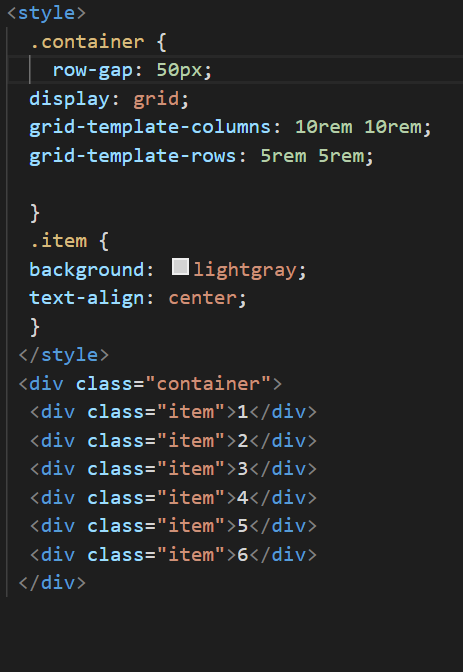
Example - Setting row gap to 50 px
Output -
3. Column-gap
This property specifies the gap between columns -
Example -
Output -
4. Gap property -
The gap property is a shorthand property for the row-gap and the column-gap properties,
And can also be used to set value of both in one value -
Example -
Output -
Example -
Output -
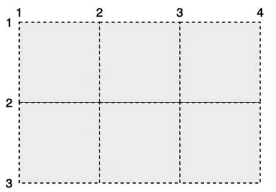
5. Grid Lines
With the grid tracks defined, the next portion of the code places each grid item into a specific location on the grid.
The lines between columns are called column lines, and the lines between rows are called row lines.
The browser assigns numbers to each grid line in a grid, as shown in the image below -
The CSS uses these numbers to indicate where each item should be placed.
Grid lines are numbered beginning with 1 on the top left. Negative numbers refer to the position from the bottom right.
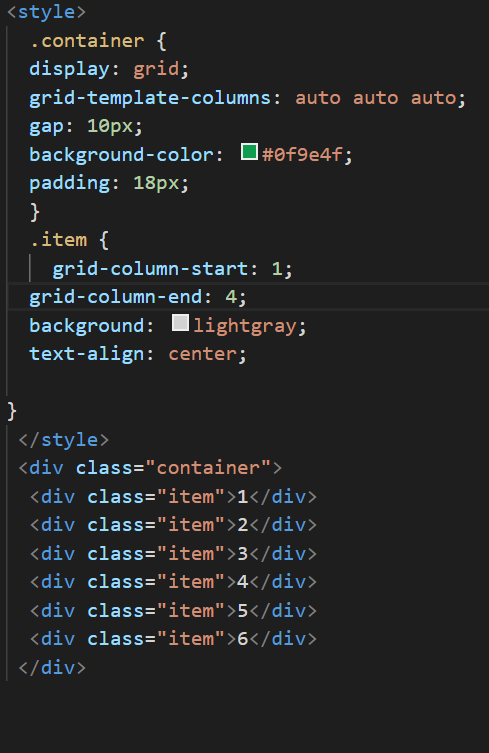
Example -Placing grid at column line1, and ending on column line 4 -
Output -