CSS grid-auto-flow Property

CSS grid-auto-flow Property


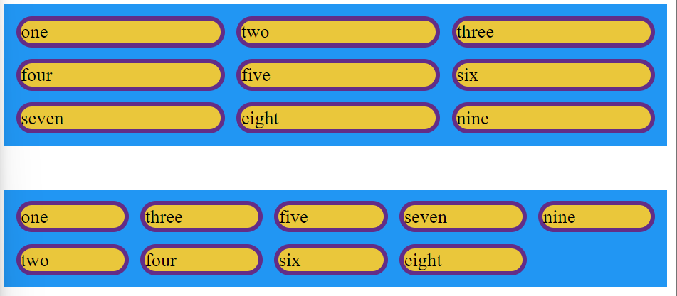
 The Grid Layout Module provides another property, grid-auto-flow, that can be used to manipulate the behavior of the placement algorithm. 

Its initial value, row, behaves as I’ve described. Given the value column, it instead places items in the columns first, moving to the next row only after a column is full. 

You can also add the keyword dense (for example, grid-auto-flow: column dense). This causes the algorithm to attempt to fill gaps in the grid, even if it means changing the display order of some grid items. 

If you apply this to your page, smaller grid items will “backfill” the gaps created by the larger grid items.

Syntax -

grid-auto-flow: row|column|dense|row dense|column dense;
 

Now we will see the values with their descriptions -

Value

Description

row

This value places the items by filling each row

column

This value places items by filling each column

dense

This value places items to fill holes in the grid

row dense

This value places items by filling each row.

column dense

This value places items by filling each column
 

Now we will see the example -

Example -

<html>
  <head>
    <title>Title of the document</title>
    <style>

    .Here  {
  display: grid;
  grid-template-columns: auto auto auto;
  grid-template-rows: auto auto;
  grid-gap: 10px;
  background-color: #2196F3;
  padding: 10px;
  grid-auto-flow: row;
}
    .HereAgain  {
  display: grid;
  grid-template-columns: auto auto auto;
  grid-template-rows: auto auto;
  grid-gap: 10px;
  background-color: #2196F3;
  padding: 10px;
  grid-auto-flow:column;
}
.here>div{
border: 4px solid rgb(99, 45, 135);
border-radius: 50px;
background-color: rgb(234, 199, 59);
}
.HereAgain>div{
border: 4px solid rgb(99, 45, 135);
border-radius: 50px;
background-color: rgb(234, 199, 59);
}
    </style>
  </head>
  <body>
    <div class="Here">
      <div class="one">one</div>
      <div class="two">two</div>
      <div class="">three</div> 
      <div class="three">four</div>
      <div class="foru">five</div>
      <div class="five">six</div>
      <div class="six">seven</div> 
      <div class="seven">eight</div> 
      <div class="eight">nine</div> 
    </div>
    <br><br>
    <div class="HereAgain">
      <div class="one">one</div>
      <div class="two">two</div>
      <div class="">three</div> 
      <div class="three">four</div>
      <div class="foru">five</div>
      <div class="five">six</div>
      <div class="six">seven</div> 
      <div class="seven">eight</div> 
      <div class="eight">nine</div> 
    </div>
  </body>
</html>

Output -