CSS Media Queries
A media query is defined as an at-rule, @media.
It specifies a medium (all, print, screen, or speech) and a condition.
If no medium is specified, it defaults to all.
If the condition is met, the CSS rules inside the block are applied to the document. If it is not met, the CSS rules are ignored.
Now we will see the syntax -
Media queries have an optional mediatype parameter. This parameter is placed directly after the @media declaration (@media mediatype).
We can add media queries in two ways -
1. Using int the same page -
Syntax -
|
@media not|only mediatype and (expressions) {
CSS-Code;
}
|
2. You want add in another page link that page usign the following syntax -
Syntax -
|
<link rel="stylesheet" media="mediatype and|not|only (expressions)" href="sample.css">
|
Now we will see an simple example -
Example -
|
<!DOCTYPE html>
<html>
<head>
<style>
.one{
--colorchange :blue;
border: 6px solid var(--colorchange);
height: 300px;
width: 300px;
border-radius: 50%;
background-color: var(--colorchange);
}
@media screen and (min-width: 700px) {
.one {
--colorchange: pink;
}
}
</style>
<script>
var root = document.querySelector(':root');
root.style.setProperty('--primarycolor', 'blue');
</script>
</head>
<body>
<div class="one">
</div>
</body>
</html>
|
Output -
Explanation -
Here we first declare a new local variable named --color change for the .one class.
We set its value to blue.
Then we use it in the .one class further down.
Then, we create a @media rule that says "When the browser's width is 700px or wider, change the --color variable value of the .one class to pink color."
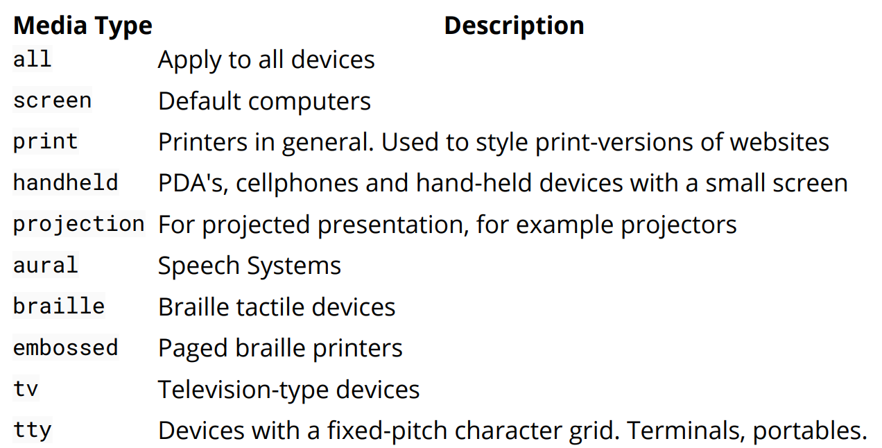
Now we will see the list of media type can be understood better with the following table-