CSS Masking
In this tutorial, you will learn about CSS Masking:
With Masking you can make some specified parts of elements transparent or opaque.
Masks are similar to Clips, but instead of defining a path you define a mask with layers over the element.
You can imagine this mask as an image what consist of mainly two colors -
- Black and
- White.
Luminance Mask -
Black means the region is opaque, and white that it's transparent, but there is also a gray area which is semi-transparent, so you are able to make smooth transitions.
Alpha Mask -
Only on the transparent areas of the mask the element will be opaque.
Example -
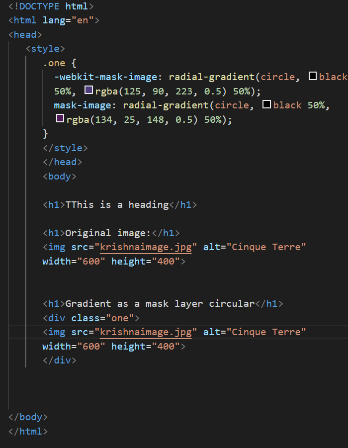
This image for example can be used as a luminance mask to make for an element a very smooth transition from right to left and from opaque to transparent.
The mask property lets you specify the mask type and an image to be used as a layer.
Now we will see Examples -
Example 1 -
Simple mask that fades an image from solid to transparent -
CSS -
|
div {
height: 200px;
width: 200px;
background: url(http://aimageurlwithheightwidth/200/200/nature/1);
mask-image: linear-gradient(to right, white, transparent);
}
|
HTML -
In the above example there is an element with an image as its background. The mask that is applied on the image (using CSS) makes it look as though it is fading out from left to right.
The masking is achieved by using a linear-gradient that goes from white (on the left) to transparent (on the right) as the mask. As it is an alpha mask, the image becomes transparent where the mask is transparent.
Output -
Without masking -
Output with masking -
Note -
As mentioned in remarks, the above example would work in Chrome, Safari and Opera only when used.
Example 2 -
Output -