Responsive Web Design - Images
Previously, we used a media query to change the size of an image if the viewport was narrower than a certain threshold.
There is another technique we can use that allows images to scale with the viewport width without using media queries.
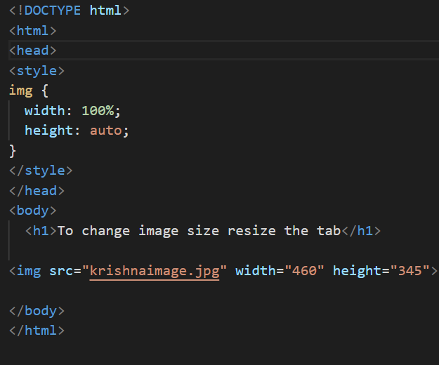
Using The width Property
Property is set to a percentage and the height property is set to "auto", the image will be responsive and scale up and down.
Example -
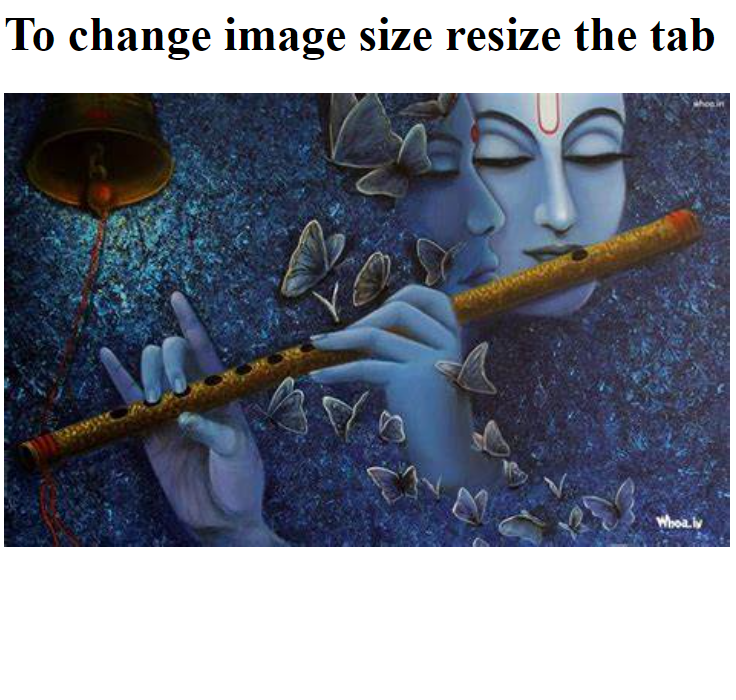
Output
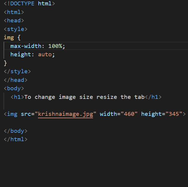
max-width Property -
If Property value is set to 100% image can scale downwards but not upwards
Example -
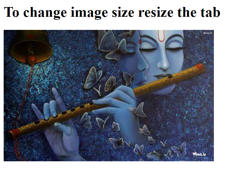
Output
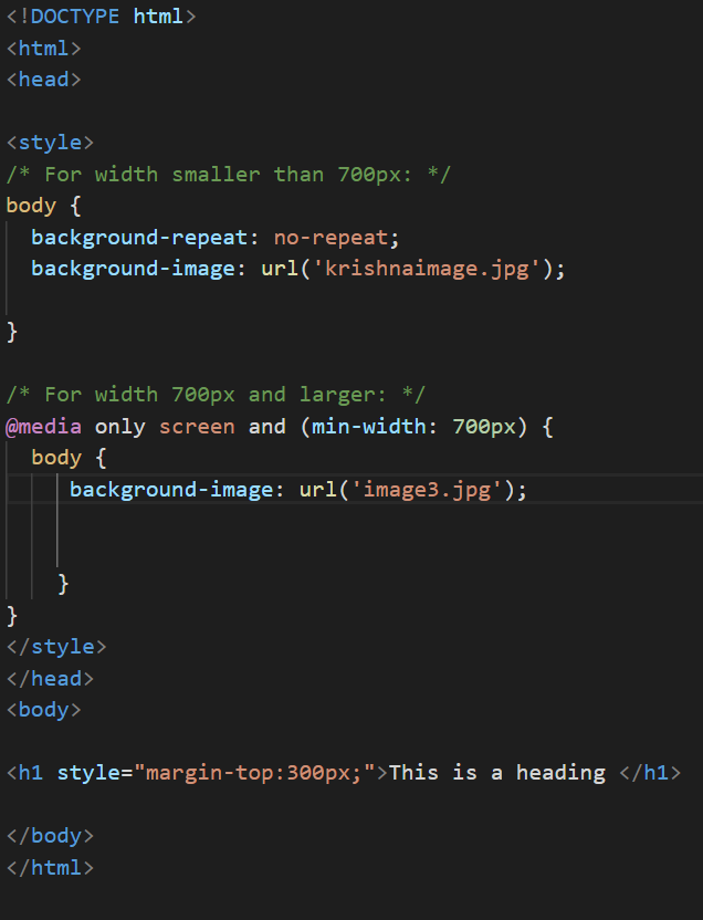
Change image as size changes -
Different images for different screen sizes -
Example -
Output -