
|
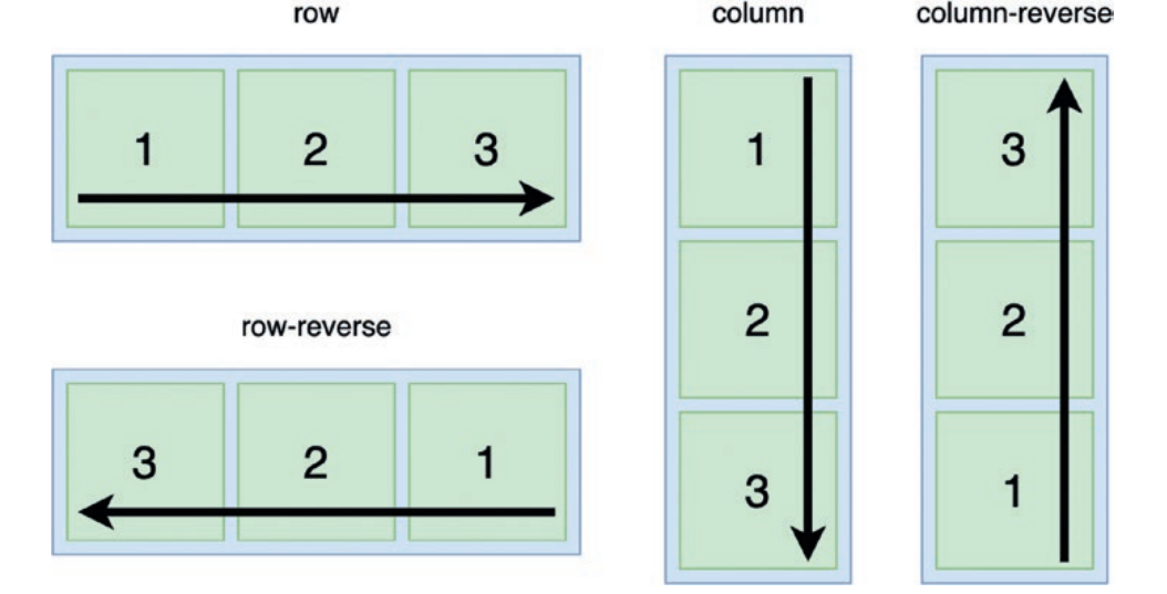
flex-direction: row|row-reverse|column|column-reverse|initial
|
|
<style>
.container { display: flex; flex-direction: row; border: 1px solid black; } .item, .item2, .item3 { background: rebeccapurple; font-size: 3rem; padding: 2rem; color: white; } .item2 { background: skyblue; } .item3 { background: orangered; } </style> <div class="container"> <div class="item">1</div> <div class="item2">2</div> <div class="item3">3</div> </div> |

|
<!DOCTYPE html>
<html> <style> </style> <body> <link rel="stylesheet" href="sample.css"> <div class="header"> <h1>Responsive Image Gallery</h1> <p>Resize the browser window to see the responsive effect.</p> </div> <div class="row"> <div class="columns"> <img src="image1.jpg" style="width:100%"> <img src="image2.png" style="width:100%"> <img src="krishnaimage.jpg" style="width:100%"> <img src="image1.jpg" style="width:100%"> <img src="image3.png" style="width:100%"> <img src="krishnaimage.jpg" style="width:100%"> <img src="image1.jpg" style="width:100%"> </div> <div class="columns"> <img src="image1.jpg" style="width:100%"> <img src="image2.png" style="width:100%"> <img src="image1.jpg" style="width:100%"> <img src="image2.png" style="width:100%"> <img src="krishnaimage.jpg" style="width:100%"> <img src="image1.jpg" style="width:100%"> <img src="image3.png" style="width:100%"> </div> <div class="columns"> <img src="image1.jpg" style="width:100%"> <img src="image2.png" style="width:100%"> <img src="krishnaimage.jpg" style="width:100%"> <img src="image1.jpg" style="width:100%"> <img src="image3.png" style="width:100%"> <img src="krishnaimage.jpg" style="width:100%"> <img src="image1.jpg" style="width:100%"> </div> <div class="columns"> <img src="image1.jpg" style="width:100%"> <img src="image2.png" style="width:100%"> <img src="krishnaimage.jpg" style="width:100%"> <img src="image1.jpg" style="width:100%"> <img src="image3.png" style="width:100%"> <img src="krishnaimage.jpg" style="width:100%"> <img src="image1.jpg" style="width:100%"> </div> <div class="columns"> <img src="image1.jpg" style="width:100%"> <img src="image2.png" style="width:100%"> <img src="krishnaimage.jpg" style="width:100%"> <img src="image1.jpg" style="width:100%"> <img src="image3.png" style="width:100%"> <img src="krishnaimage.jpg" style="width:100%"> <img src="image1.jpg" style="width:100%"> </div> <div class="columns"> <img src="image1.jpg" style="width:100%"> <img src="image2.png" style="width:100%"> <img src="krishnaimage.jpg" style="width:100%"> <img src="image1.jpg" style="width:100%"> <img src="image3.png" style="width:100%"> <img src="krishnaimage.jpg" style="width:100%"> <img src="image1.jpg" style="width:100%"> </div> <div class="columns"> <img src="image1.jpg" style="width:100%"> <img src="image2.png" style="width:100%"> <img src="krishnaimage.jpg" style="width:100%"> <img src="image1.jpg" style="width:100%"> <img src="image3.png" style="width:100%"> <img src="krishnaimage.jpg" style="width:100%"> <img src="image1.jpg" style="width:100%"> </div> <div class="columns"> <img src="image1.jpg" style="width:100%"> <img src="image2.png" style="width:100%"> <img src="krishnaimage.jpg" style="width:100%"> <img src="image1.jpg" style="width:100%"> <img src="image3.png" style="width:100%"> <img src="krishnaimage.jpg" style="width:100%"> <img src="image1.jpg" style="width:100%"> </div> </div> </body> </html> |

