CSS Flex Items
An element using flexbox as its layout is referred to as a flex container, and the elements inside it are flex items.
Basically we study six properties in flex items mentioned down below -
- order
- flex-grew
- flex-shrink
- flex-basis
- flex
- align-self
Now we will see each one of them with their definitions and example -
1. Order -
By default, items are laid out according to two factors:
This ordering can be changed by using the order property on flex items.
This property, when set on a flex item, defines the order in which it appears.
Multiple flex items can have the same value for the order property.
If more than one item has the same order, those items will be laid out in the order they appear in the source HTML.
Default value is 0.
Now we will see Example -
Example -
|
<!DOCTYPE html>
<html>
<head>
<style>
.container {
display: flex;
flex-direction: row;
border: 1px solid black;
}
.item,
.item2,
.item3 {
background: rebeccapurple;
font-size: 3rem;
padding: 2rem;
color: white;
}
.item2 {
background: skyblue;
}
.item3 {
background: orangered;
}
.div{
}
</style>
</head>
<body>
<div class="container">
<div class="item" style="order: 2" >1</div>
<div class="item2" style="order: 3">2</div>
<div class="item3" style="order: 1">3</div>
</div>
</body>
</html>
|
Output -
2. Flex-grow
Some property values take no units at all but rather just a number.
For example,
the opacity property expects a number between 0 and 1. Another example of this is some flexbox properties such as flex-grow and flex-shrink, which expect integer numbers without units.
Example - For flex grow -
|
<!DOCTYPE html>
<html>
<head>
<style>
.container {
display: flex;
flex-direction: row;
border: 1px solid black;
}
.item,
.item2,
.item3 {
background: rebeccapurple;
font-size: 3rem;
padding: 2rem;
color: white;
}
.item2 {
background: skyblue;
}
.item3 {
background: orangered;
}
</style>
</head>
<body>
<div class="container">
<div class="item" style="flex-grow: 1" >1</div>
<div class="item2" style="flex-grow: 8">2</div>
<div class="item3" style="flex-grow: 1">3</div>
</div>
</body>
</html>
|
Output -
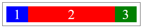
3. Flex-shrink
By default, it will try to shrink all elements evenly.
Just like we can control growth with flex-grow, we can also control shrinking with flex-shrink.
The flex-shrink property specifies the amount of shrinking that can be done to a flex item relative to the other items.
This defaults to 1, which is why all of the elements were shrunk evenly.
Example - Specifying flex-shrink of 2
|
<style>
.container {
border: 1px solid black;
padding: 0.5rem;
width: 300px;
display: flex;
flex-direction: row;
}
.item {
width: 200px;
font-size: 2rem;
color: white;
text-align: center;
}
.one {
background: blue;
}
.two {
background: red;
flex-shrink: 2;
}
.three {
background: green;
}
</style>
<div class="container">
<div class="item one">1</div>
<div class="item two">2</div>
<div class="item three">3</div>
</div>
|
Output -
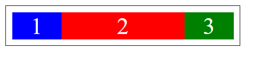
4. flex-basis (item)
The flex-basis property sets the initial size of a flex item along the main axis before flex-grow and flex-shrink factors are applied
Example -
|
<style>
.container {
border: 1px solid black;
padding: 0.5rem;
width: 300px;
display: flex;
flex-direction: row;
}
.item {
width: 200px;
font-size: 2rem;
color: white;
text-align: center;
}
.one {
background: blue;
}
.two {
background: red;
flex-basis: 500px;
}
.three {
background: green;
}
</style>
<div class="container">
<div class="item one">1</div>
<div class="item two">2</div>
<div class="item three">3</div>
</div>
|
Output -
5. Flex
flex property is a shorthand property for the flex-grow, flex-shrink, and flex-basis properties.
Example -
Output -
6. Align-self
The align-items property applies the alignment to all of the flex items, but an individual item can specify its own individual alignment that overrides what was set on the container with the align-self property.
Example -
Output-


