


|
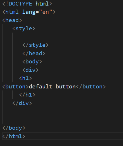
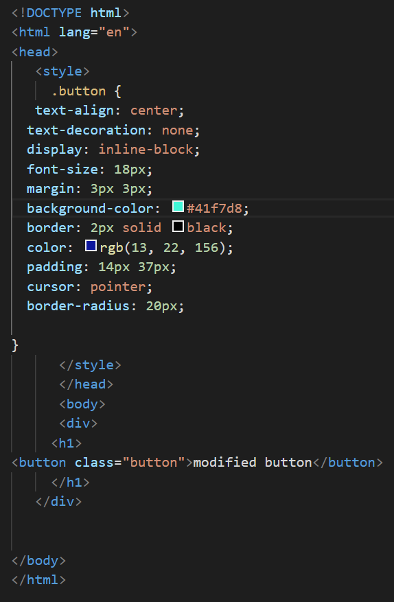
<!DOCTYPE html>
<html lang="en"> <head> <style> .button { text-align: center; text-decoration: none; display: inline-block; font-size: 18px; margin: 3px 3px; background-color: #41f7d8; border: 2px solid black; color: rgb(13, 22, 156); padding: 14px 37px; cursor: pointer; border-radius: 20px; box-shadow: 0 15px 11px 0 rgba(26, 180, 226, 0.2), 0 6px 20px 0 rgba(0,0,0,0.19); } .button:hover{ text-align: center; text-decoration: none; display: inline-block; font-size: 18px; margin: 3px 3px; background-color: #4f65e4; border: 2px solid black; color: rgb(241, 245, 23); padding: 14px 37px; cursor: pointer; border-radius: 20px; box-shadow: 0 11px 18px 0 rgba(7, 11, 238, 0.849), 0 6px 20px 0 rgba(0,0,0,0.19); } </style> </head> <body> <div> <h1> <button class="button">modified button</button> </h1> </div> </body> </html> |
