CSS Rounded Borders
By default, blocks have 90-degree rectangular corners.
That isn't always the most aesthetically pleasing design, though.
To address this, CSS gives us the border-radius property.
This property gives us rounded corners. The corners can be circular or elliptical.
The border-radius property allows you to change the shape of the basic box model.
Every corner of an element can have up to two values, for the vertical and horizontal radius of that corner (for a maximum of 8 values).
The first set of values defines the horizontal radius. The optional second set of values, preceded by a ‘/’, defines the vertical radius.
If only one set of values is supplied, it is used for both the vertical and horizontal radius.
border-radius: 10px 5% / 20px 25em 30px 35em;
The 10px is the horizontal radius of the top-left-and-bottom-right.
And the 5% is the horizontal radius of the topright-and-bottom-left.
The other four values after '/' are the vertical radii for top-left, top-right, bottom-right, and bottom-left.
Syntax -
border-radious: value;
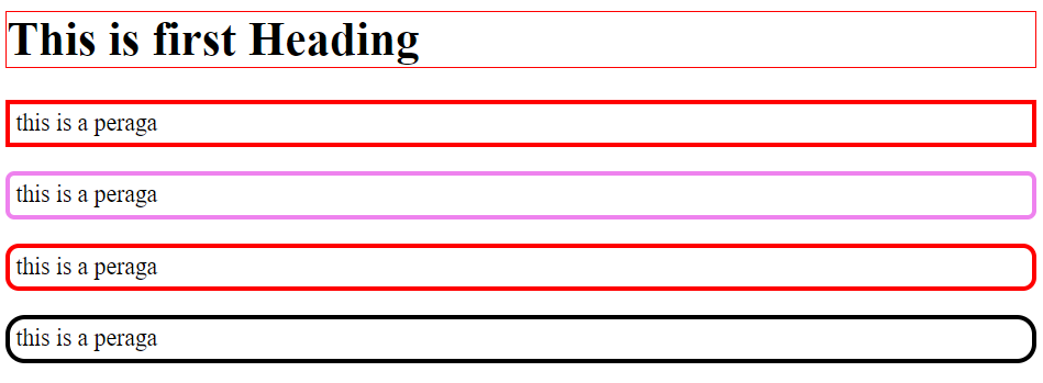
Now we will see some examples -
Example -
.html file -
.css file -
Output -