CSS Transitions
A CSS transition is a way of animating an element from one state to another.
They are similar to, but not quite the same as, CSS animations which we will study after this topic
During the lifetime of a page, an element’s CSS properties can change.
For example, the user could hover over an element, triggering the : hover pseudo-class, which could apply some different styling.
Or, maybe, a class is added to or removed from an element with JavaScript. In both of these cases, any style changes are applied immediately. Let’s take the example of a hover state.
There are mainly four properties -
-
transition-property The specific CSS property whose value change needs to be transitioned (or) all, if all the transitionable properties need to be transitioned.
-
transition-duration The duration (or period) in seconds (s) or milliseconds (ms) over which the transition must take place.
-
transition-timing-function
A function that describes how the intermediate values during the transition are calculated. Commonly used values are ease, ease-in, ease-out, ease-in-out, linear,
cubic-bezier(), steps(). More information about the various timing functions can be found in the W3C specs.
specified in seconds (s) or milliseconds (ms).
There is one more thing -
Transition shorthand -
We can use transition property for shorthand -
Example 1 -
CSS -
|
div{
width: 150px;
height:150px;
background-color: red;
transition: background-color 1s;
}
div:hover{
background-color: green;
}
|
HTML -
Output -
Output will change on hover
Easing Function
These functions are usually given as Cubic Bezier curves. A Cubic Bezier curve is created by specifying four points on a graph. The points are plotted, and a curve is drawn. A good way to think of how the curve is drawn is like this: -
Think of a straight line drawn between the first and last points. Then, the second and third points “bend” the line up and down toward them to make a curve.
In a Cubic Bezier curve for a CSS easing function, the first point is always (0, 0) and represents the start state of the animation or transition.
The last point is always (1, 1) and represents the end state.
The X-coordinate of the two middle points must be between 0 and 1, or else it is not considered a valid easing function and will be ignored.
Since the first and last points of the curve are always (0, 0) and (1, 1), we only need to specify the X and Y coordinates of the two middle points that “bend” the curve -
|
transition-timing-function:
cubic-bezier(.17, .67, .9, .6);
|
The given cubic-bezier function yields the curve shown in images given below -
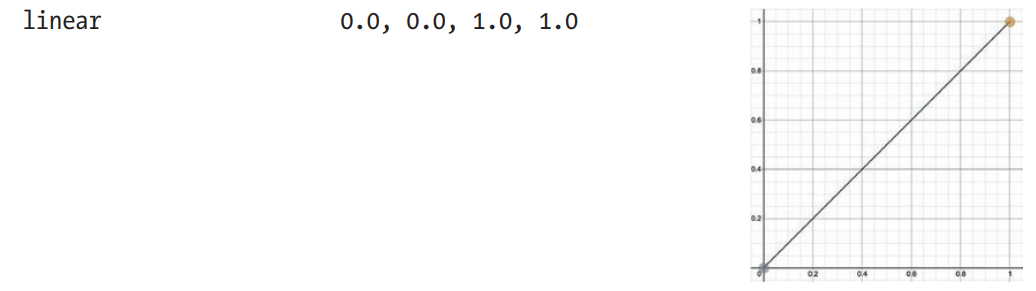
There are several built-in easing functions which you can specify by name instead of a cubic-bezier function.
These functions are shown in the images down below -
Example -
Using all four properties -
Output -
Output changes shape on hover.