Text Shadow In CSS
The text-shadow property allows you to add shadows to text.
A text-shadow has X and Y offsets, an optional blur radius, and a color.
Unlike box-shadow, text-shadow does not have a spread radius.
Or in other words -
In simple words - To add shadows to text, use the text-shadow property.
The syntax is as follows -
Syntax -
|
text-shadow: horizontal-offset vertical-offset blur color;
|
Now we will see examples -
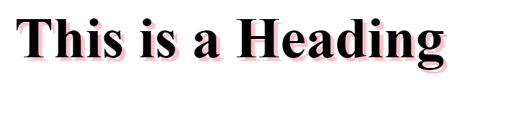
Example 1 -
Text shadow without blur radius -
Output -
This creates a pink shadow effect around a heading
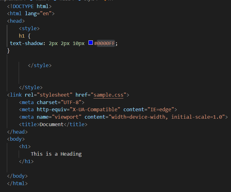
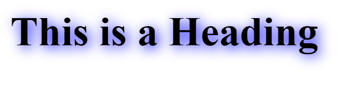
Example 2 - Shadow with a blur radius -
Output -
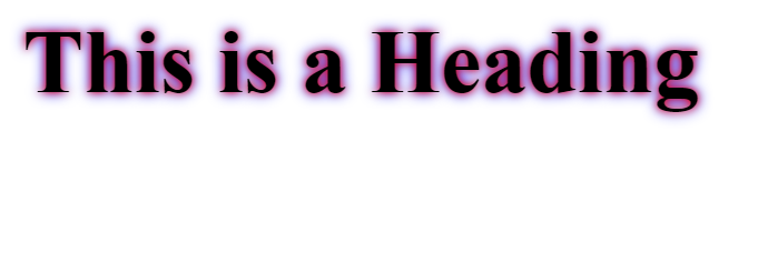
Example 3 - Multiple shadows -
To give an element multiple shadows, separate them with commas.
Output -