CSS Units
To give an element padding of 10 pixels, we would specify a value of 10px for the padding property.
In this expression, we say that px is a unit.
CSS units are equivalent to different units of measurement.
In the physical world, measurements have units such as inches, feet, or meters.
Similarly, CSS has units such as px, em, and rem. We will go over some of these in this topic.
Note -
One important thing to notice is that there should be no gap between number and a unit.
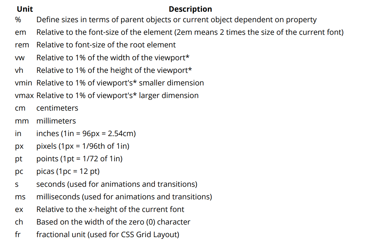
Now given a image which shows all possible measuring units in CSS -
A CSS distance measurement is a number immediately followed by a length unit (px, em, pc, in, …) CSS supports a number of length measurements units.
They are absolute or relative.
using rem in font size
CSS3 introduces a few new units, including the rem unit, which stands for "root em".
Let's look at how rem works.
First, let's look at the differences between em and rem.
element. This means it's possible to declare a single font size for the html element and define all rem units to be a percentage of that.
This means it's possible to declare a single font size for the html element and define all rem units to be a percentage of that.
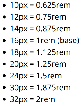
The main issue with using rem for font sizing is that the values are somewhat difficult to use.
Here is an example of some common font sizes expressed in rem units, assuming that the base size is 16px :
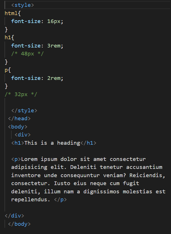
Now we will see Example -
Example -
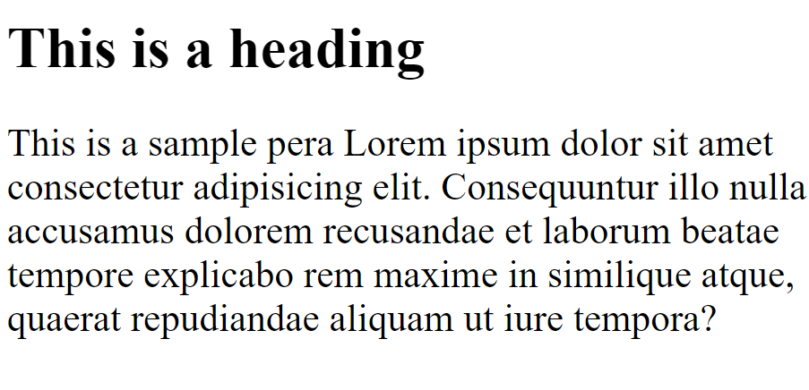
Output -