Responsive Web Design The Viewport
In order for a site to look correctly on mobile devices, you will need to add the viewport meta tag to your HTML inside the head element -
|
"viewport"content="width=device-width, initial-scale=1.0">
|
Explanation -
1. The width=device-width part sets the width of the page to follow the screen-width of the device.
2. The initial-scale=1.0 This sets the initial zoom level when the page is first loaded on the browser side.
This tells the browser how to set the page’s dimensions and zoom level.
The typical value used for width is device-width; however, this could also be set to an explicit pixel width as well.
In other words -
View-port is the width of the device itself. If your screen resolution says the resolution is 1280 x 720, your view-port width is "1280px".
More often, many devices allocate different pixel amounts to display one pixel.
For an example iPhone 6 Plus has 1242 x 2208 resolution. But the actual viewport-width and viewport-height is 414 x 736.
That means 3 pixels are used to create 1 pixel.
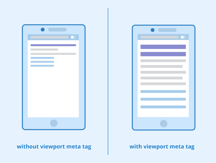
The below Image Explains the above theory