This property is used to set the row size in the grid container.
Syntax -
|
grid-auto-rows: auto|max-content|min-content|length; |
Now we will see the values with descriptions -
|
Value |
Description |
|
auto |
Row size is determined by the size of the largest item in the row, and this is the default value. |
|
max-content |
This sets the size of each row to which depends upon the largest item in the row. |
|
min-content |
This sets the size of each row which depends upon the largest item in the row |
|
length |
By using a legal length value this sets the size of the rows by |
Now we will see the example -
Example 1 -
|
<style> |
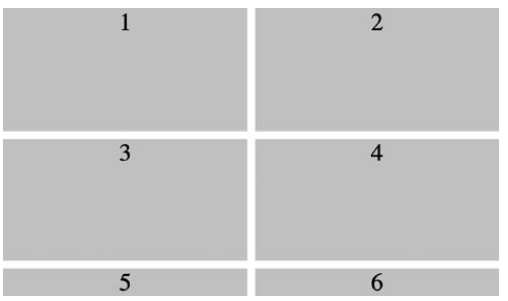
Output -
We see items 5 and 6 in the grid. These items are in the implicit grid.
Also notice that they are automatically sized to fit their content.
This is the default behavior for implicit grid items.
This behavior can be controlled with the grid-auto-rows property, where we specify the sizing for implicit grid rows.
Example -
specifying grid-auto-rows
|
<style> |
Output -