
|
background-size: length | percentage [ length | percentage ]
|
|
auto
|
The background image is displayed in its original size, this is the default value.
|
|
length
|
Sets the width and height of the background image. The first value sets the width, the second value sets the height. If one value is given, the other is set to "auto".
|
|
percentage
|
Sets the width and height of the background image in percent of the parent element. The first value sets the width, the second value sets the height. If one value is given, the another is set to "auto"
|
|
cover
|
Resize the background image to cover the entire container.
|
|
contain
|
Resize the background image to make sure the image is fully visible on the screen.
|
|
initial
|
Set this property to its default value.
|
|
inherit
|
Inherits this property from its parent element.
|
|
<style>
.header-image { background-image: url('mountains.jpg'); height: 15rem; border: 3px solid #000000; } </style> <div class="header-image"> <h1>Welcome to my site</h1> </div> |

|
<style>
.header-image { background-image: url('mountains.jpg'); background-repeat: no-repeat; height: 15rem; border: 3px solid #000000; } </style> <div class="header-image"> <h1>Welcome to my site</h1> </div> |

|
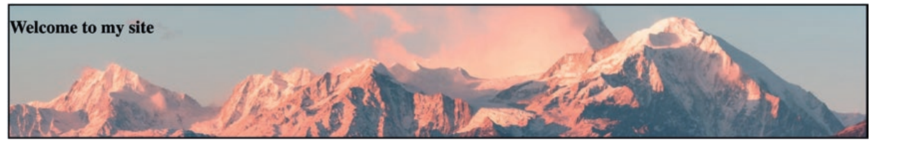
<style>
.header-image { background-image: url('mountains.jpg'); background-size: cover; height: 15rem; border: 3px solid #000000; } </style> <div class="header-image"> <h1>Welcome to my site</h1> </div> |

|
<style>
.header-image { background-image: url('mountains.jpg'); background-size: cover; background-position: center; height: 15rem; border: 3px solid #000000; } </style> <div class="header-image"> <h1>Welcome to my site</h1> </div> |

|
<style>
.header-image { background-image: url('mountains.jpg'); background-size: 100px 300px; height: 15rem; border: 3px solid #000000; } </style> <div class="header-image"> <h1>Welcome to my site</h1> </div> |
